skip to main |
skip to sidebar
Whew, blogs are such a responsibility! Eager as I am to share my work with the world, keeping this thing up to date ends up just being one more Thing To Do in an already overheated schedule. But I'm not complaining! Au contraire, I'm very grateful to be kept fairly busy. Of course, at this stage of my career it's not all graphic recording that I'm being kept busy with – but each month I get a bit more graphic work than I had the month before, and I'm confident that it will continue to multiply.
 I've got a whole spate of interesting gigs coming up, but meanwhile here's some work I did last month. This one was the outcome of a very fortuitous connection with Brenda Chaddock, facilitator extraordinaire, who invited me to do the graphic recording for a session she was facilitating for BC Healthy Communities (Vancouver Coastal Region). I started by doing something I hadn't done before, which was to prepare some custom chartwork in advance – in this case, a poster outlining the guidelines for hosting a World Cafe dialogue. I'm particularly pleased with this piece, as I think it's inviting and has a nice flow. (Click on the graphics to see larger images.)
One thing I especially enjoyed about this session was that I was very involved in the planning conversations, which allowed me to really integrate the graphics into the day and introduce a couple of innovations (or what seemed to me to be innovations, at any rate!) Brenda was going to start off the day by having people pair off, introduce themselves to each other, and talk about what called them to be there that day. I suggested we pass out  paper and pens and ask folks to draw an image symbolizing how they were feeling as they came into the session – what kind of energy they were bringing with them. Brenda liked the idea and added it to the intro section. We wound up using sticky notes, which I collected, grouped into themes, and stuck on a large sheet of paper to create a kind of 'tapestry' of the collective energy in the room. This is what it looked like.
I like this piece not because it's particularly stunning visually, but because it creates more interaction between the people in the room and the graphics. Usually it's just me drawing and writing and recording people's comments – but this puts the pens in the hands of the participants and invites them to unleash their own 'inner artist'! This is something I want to bring into this work more and more. I'd really like to make as many of these pieces as possible a true co-creation between me and the other folks in the room – perhaps even others who weren't in the room at the time but are somehow involved in the process!
OK, I'm going into my mid-afternoon coma – time for a break, and I'll come back with more later.
 Well, although this is a bit after the fact, I'd like to report that in January I gave my first-ever presentation! The group I presented to is the BC Centre for Quality – a professional organization that describes itself as "a forum for learning where quality practitioners explore the principles and applications of organizational excellence." The president of BCCQ, Ann Brown, is an enthusiast of graphic facilitation and wanted to show the impact of the process to their membership. She had somehow discovered my blog (this in itself is exciting), liked what she saw, and wondered if I'd be willing to make a presentation at their next breakfast meeting. Of course I said yes!
So on a windy January morning, I showed up at their meeting room on the top floor of the Coast Plaza Hotel (fabulous view), and proceeded to explain the process and purpose of graphic facilitation and graphic recording. Of course, GF is something best experienced by experiencing it, not by being told about it – so I kept the presentation fairly short and quickly swung into the actual process. The idea was to pose a question to the group and then record the ideas that flowed in response. Since their breakfast meetings are a core part of the way BCCQ interacts as a group, the question was: What makes a great breakfast meeting? The ideas flowed thick and fast, and this is what they looked like:
 The folks were really enthusiastic about the process, but several lamented that they "were not artistic" and could never do this themselves. All the more reason to hire me, sez I – but I don't like to see people downgrading their own creativity, so I thought I'd try something fun. On the spur of the moment I handed everyone a piece of paper and a coloured marker, and announced that I was going to prove to them that they could draw.
A few looked skeptical, others looked downright chagrined, but I assured them artistic talent was not a prerequisite. "I'm going to give you 2 minutes," I said, "and in those 2 minutes I'd like you to draw a picture of how you're feeling at the end of this session." It can be a picture, a symbol, or just a scribble, I said, but it has to be an image, not words. "Ready? Go!"
For the next two minutes I watched as everyone in the room turned into a playful kid. Their faces were a fascinating combination of amusement, puzzlement, seriousness and glee as they put their minds to the problem. After the requisite two minutes, I asked everyone to hold up their page and show it to the rest of the room. Every single person had created an image that clearly expressed a feeling. "Congratulations," I grinned at them: "You're now all officially artists!" Everyone beamed.
I'm going to talk about this more in a later post, because there's something important here. What is it about drawing that both scares and frees us? Stay tuned...
Greetings from my new address!
Yes, I've changed my URL from axisofemail to my own name. "Why?" you ask? Well, when I set up this blog last summer, I was in a political snit. "Axis of email" popped into my head in response to the Axis of You-know-what that we kept hearing about in the news. And I confess, I thought it rather witty. However – it's not exactly an intuitive address. You don't think, "Avril Orloff – I wonder where I might find her – oh, of course, she's at the Axis of Email!"
So I thought, well, how about using my actual name? Especially since, as far as I know, I'm the only Avril Orloff in the world! That would make it really easy to find me. So that's what I did. Or rather, my friend Elen did it for me. Elen is a computer maven who understands the strange language that lurks behind the thin veneer of user-friendliness on the surface of computers – a world I dare not enter. She offered to do what was necessary to transfer my blog to my domain. And minutes later, voila! A new address. Thank you, Elen!
The only downside is that apparently Blogger users who switch to FTP transfer no longer have access to all the easy set-up features that Blogger Beta included. So now it's back to trying to figure out which of those strings of HTML I need to tweak to make any changes to the look of this thing. Sigh...
PS: By the way, Elen also has a fascinating blog, and turned a lot of her material into a book. Don't Shoot! I have another story to tell you… Check it out.
A few weeks ago my friend Kate Sutherland asked me to do something a bit different. Instead of asking me to record a meeting, she wanted to use visuals to present a proposal for a conference she's designing. She thought that presenting her ideas visually would be more engaging than a standard, straight-text proposal. So we went to work. Kate had prepared a mind map of her concept, and we spent some time going over it and refining the design. Then I got busy with my markers, and here's what emerged a couple of hours later:
 As soon as it was done, Kate rolled it up and whisked it off to the group. The next day I got a delighted email from her, telling me the presentation had been a huge hit! "Presenting the community engagement proposal through graphic images was very powerful," she wrote. "The colours and images and large scale of the paper immediately drew peoples' interest and sustained attention. It was a wonderful and quick way to get all the people in the meeting up to speed, on the same page, and buying in. And committee members felt freer to interact with the graphic presentation than they do with a Power Point — for example, suggesting additional images and arrows."
Needless to say, I was very excited. Both by the fact that the drawing had such a strong effect, and by the fact that people felt free to interact with it. I wasn't present at Kate's meeting, but when I'm in the room I always check in with the people there to make sure I've heard and recorded their thoughts correctly. Sometimes I leave a space for people to add their own words and doodles, or provide sticky notes so they can add other thoughts, corrections, etc. Ultimately I'd like to find ways of building more interactivity right into the process so that people can express their own creativity!
 How time flies when you're having fun. It's already 2007! HAPPY NEW YEAR, faithful readers!! (All two of you.)
I know bloggers are supposed to post regularly, but I've got an excuse for being remiss: December was a very moving month for me. Literally. I moved. If you've ever moved house, you know how chaotic your life becomes before, during, and for a good while after. I'm in the middle of that chaos right now. But I will have some new pix to post very soon. Meanwhile, here is a picture of my living room — an artwork in progress. Please ignore the randomly scattered furniture and admire the colour. It's called Velvet Red. I've always wondered who dreams up all the names for all those paint colours. Wouldn't that be a great job?
Well, here's to health, happiness, prosperity, and of course, WORLD PEACE in 2007! Stay tuned for developments...
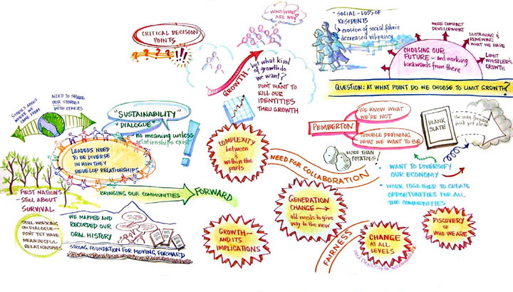
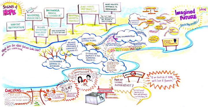
A couple of entries ago I expressed a hope that I'd get permission to post the drawings from a session I did up in Whistler with the Imagine BC Sea-to-Sky group. Well, I got permission, so here are the drawings: (click on a picture to view a larger image)
Confession: the top drawing is just a detail, not the whole sheet. When I looked at the original with a critical eye I realized it was kind of chaotic — the information from one area spilled over into another area so it was difficult to distinguish between the discrete parts. So I just posted the good bits here! The bottom drawing is better organized, I think — but then, I had the advantage of doing that one a bit after the fact, whereas the one above was done "live" as people were talking. That's the big challenge, trying to organize ideas and information that's flying at you thick and fast.
My mentor Christina Merkley subsequently coached me on how to organize information better on the page, with frames, heads and subheads, bullets, separator lines and so on. I tried to put those ideas into practice in my Sechelt drawings (Charrette Syndrome, below), and think I was fairly successful.
Another day, another lesson learned…
 I've got a whole spate of interesting gigs coming up, but meanwhile here's some work I did last month. This one was the outcome of a very fortuitous connection with Brenda Chaddock, facilitator extraordinaire, who invited me to do the graphic recording for a session she was facilitating for BC Healthy Communities (Vancouver Coastal Region). I started by doing something I hadn't done before, which was to prepare some custom chartwork in advance – in this case, a poster outlining the guidelines for hosting a World Cafe dialogue. I'm particularly pleased with this piece, as I think it's inviting and has a nice flow. (Click on the graphics to see larger images.)
 paper and pens and ask folks to draw an image symbolizing how they were feeling as they came into the session – what kind of energy they were bringing with them. Brenda liked the idea and added it to the intro section. We wound up using sticky notes, which I collected, grouped into themes, and stuck on a large sheet of paper to create a kind of 'tapestry' of the collective energy in the room. This is what it looked like.